


Register as an organizer
Click the button below and finish your organizer registration, or fill out the form and we will be in touch to assist you.
So, you're planning an event and need a way to get people signed up. That's where a good landing page comes in. But not just any landing page – we're talking about custom event landing pages that actually get people to commit. It’s not just about putting information out there; it’s about making people *want* to be there. We'll look at how the layout and what you say can make a big difference in selling out your event faster. Think of it as designing a space that makes people feel excited and confident in signing up.
Your event landing page's headline is the first thing people see. It needs to grab their attention right away and make them want to learn more. Think of it as the handshake for your event. If it's weak, people might just turn around and leave. We want them to stick around, right? So, how do we make headlines that actually work?
Forget just stating what your event is. Instead, focus on what the attendee gets out of it. What problem does your event solve for them? What transformation will they experience? Frame your headline around these outcomes. For example, instead of "Annual Tech Conference," try "Master AI Trends and Boost Your Career." It tells people exactly what's in it for them.
The subheadline is your chance to add a little more detail and build interest. It should complement the main headline and give a clearer picture of the event's value. Think about asking a question or hinting at a unique aspect. For instance, if your headline is "Learn to Code in a Weekend," a subheadline could be, "No prior experience needed – build your first app by Sunday." It answers a potential question and sets expectations.
Nobody has time to decipher a complicated headline. Get straight to the point. Use simple words and short sentences. Your goal is to communicate the core benefit and topic of your event quickly. If people have to think too hard about what your event is about, they'll probably just click away. Keep it direct and easy to understand.
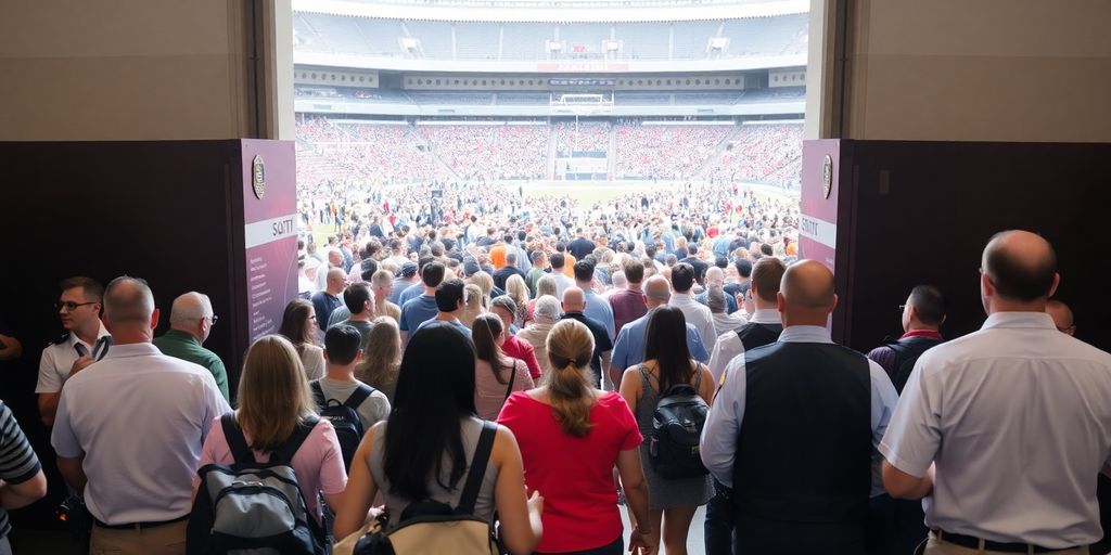
People are visual creatures, right? So, when you’re putting together an event landing page, you can’t just slap some text on there and expect people to get excited. You need to show them what they’re missing. Think about it: a wall of text is boring. But a great picture or a short video? That can grab someone’s attention and make them feel something about your event. It’s about painting a picture, not just listing facts. This visual approach helps potential attendees imagine themselves at your event, making it more appealing.
Choosing the right photos is a big deal. You want images that scream “awesome event!” Forget generic stock photos that look like they were taken in a vacuum. Find pictures that show real people having a good time, or that capture the energy of past events. If you’re showcasing a speaker, use a professional headshot that looks approachable, not like they’re posing for a mugshot. The goal is to make people think, “Wow, I want to be there!” It’s about creating an emotional connection right from the start. Good visuals can really help your nonprofit's mission.
Video is king, seriously. A short, punchy video can do more than a dozen static images. Think about a quick highlight reel from a previous event, a welcome message from the organizer, or even a sneak peek at what attendees will experience. Keep it brief – people have short attention spans online. Aim for under two minutes, ideally even less. Make sure the video quality is decent, too. Shaky, poorly lit videos are a turn-off. A well-made video can really sell the experience.
Don't underestimate the power of good design elements beyond photos and videos. Icons can break up text and make information easier to digest. Think about using them to represent different parts of your event schedule or the benefits of attending. Consistent branding with colors and fonts also plays a role. It all adds up to a professional look that builds trust. Simple graphics can guide the eye and make the page feel more organized and less overwhelming. It’s like giving your page a little polish.
Making it easy for people to sign up for your event is a big deal. If the registration part is a hassle, folks might just leave. We want them to stick around and complete the process, right? So, let's talk about how to make that happen.
Think about the forms people fill out online. Some are just way too long, asking for stuff you don't really need right away. For event sign-ups, keep it simple. Only ask for the absolute must-haves: name, email, maybe a phone number. Anything else can often wait until after they've committed. A shorter form means fewer reasons for someone to get frustrated and click away. It’s about removing any friction points. Imagine trying to buy something online and the checkout form has twenty fields – you’d probably abandon your cart. The same idea applies here. Keep the fields clean and easy to understand.
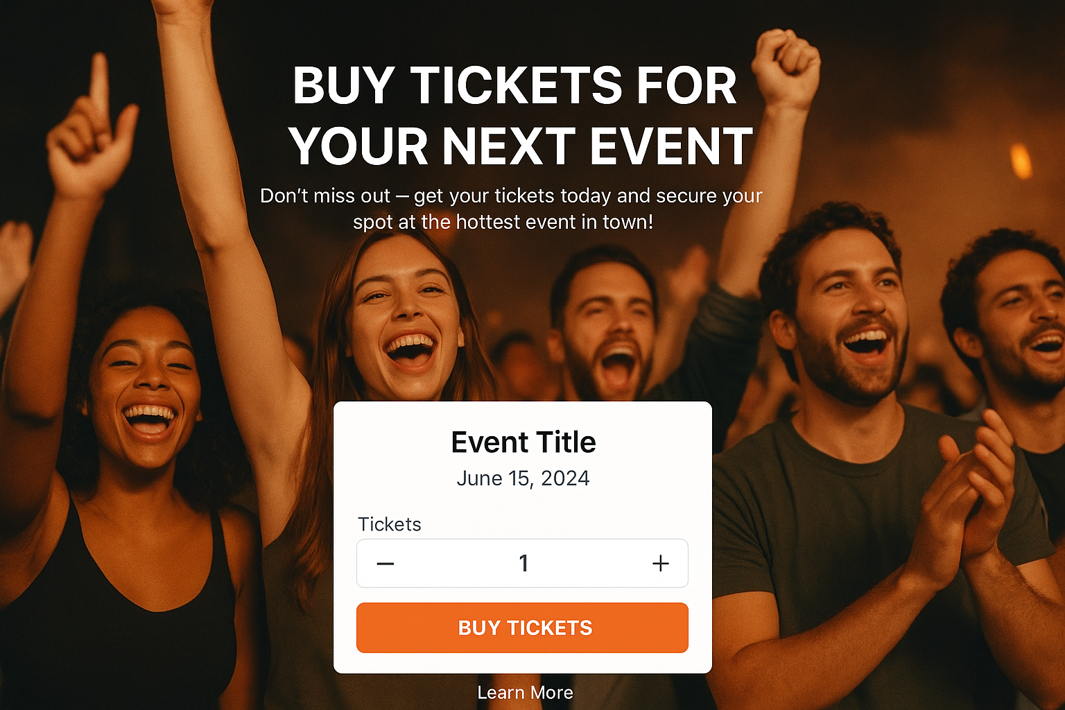
Where you put your 'Register Now' or 'Sign Up' button matters. It needs to be obvious. People shouldn't have to hunt for it. Usually, placing it prominently above the fold, or at least in a very visible spot after you've explained what the event is about, works best. Make sure the button itself stands out. Use a contrasting color that grabs attention. The text on the button should also be direct and tell people exactly what will happen when they click it. Something like 'Get Your Ticket' is usually better than just 'Submit'. A clear call to action is key to boosting event signups, so make sure it’s easy to find and understand. You can find more tips on improving your event pages at event signups.
When people are giving you their information, especially payment details, they need to feel safe. This is where trust signals come in. Think about adding security badges or logos from payment processors like Visa or Mastercard. A privacy policy link is also good practice, showing you're transparent about how you'll use their data. If you've handled events before, mentioning that or showing past event photos can also build confidence. People are more likely to complete a registration if they feel their information is protected. It’s a small detail that can make a big difference in how many people actually finish the sign-up process.
People sign up for events because they expect to get something out of it. Your landing page needs to make that crystal clear. What's in it for them? Think about what makes your event stand out from the crowd. It’s not just about listing features; it’s about showing the results attendees will achieve.
Who are you bringing in to share their knowledge? Your speakers are a huge draw. Don't just list their names; give people a reason to care. What have they accomplished? What unique insights will they share? A few bullet points about their background and what attendees will learn from them can make a big difference. For example:
What makes your event special? Is it a hands-on workshop, a networking event with industry leaders, or exclusive access to new products? Be specific. Instead of saying 'networking opportunities,' say 'connect with over 100 industry professionals during our dedicated speed networking session.' Clearly outlining these unique aspects helps potential attendees visualize their experience. Think about what problems your event solves for them. This is where you can really sell the experience and make your event irresistible. Check out some ideas for creating effective event landing pages here.
What are past attendees saying? Real feedback from happy people is incredibly powerful. Include short, impactful quotes from previous events. If you have video testimonials, even better. People trust other people more than they trust marketing copy. A few well-placed testimonials can build a lot of confidence. Consider adding:
People want to know that others have benefited from attending. Showing them that your event has a track record of success makes their decision to register much easier. It’s about building trust and demonstrating tangible benefits.
So, you've got this great event, and you've built a landing page for it. That's a good start, but just having a page isn't enough. We need to make sure people actually sign up. That means tweaking the page so it works best for everyone, no matter what device they're using. Think about how people actually use their phones and computers to find information.
Most people check things on their phones these days, right? So, your event landing page absolutely has to look good and work well on a small screen. This isn't just about shrinking things down; it's about rethinking the layout. Buttons need to be big enough to tap easily, and text should be readable without squinting. We're talking about making the whole experience smooth, from the moment someone lands on the page to when they hit that submit button. It’s about making it easy for them to convert, and personalizing the visitor experience can really help with that. Tailoring the journey makes a big difference.
Nobody waits around for a slow page to load. If your event page takes too long, people will just leave. Seriously, they'll find something else. This means keeping images optimized, not overloading the page with too much stuff, and making sure the code is clean. A quick page means a happier visitor, and a happier visitor is more likely to stick around and register.
How do you know what's working best? You test it. A/B testing is basically trying out two different versions of something – maybe a headline, a button color, or even the text on a form – to see which one gets more sign-ups. It’s a smart way to figure out what really grabs people’s attention and makes them act. You might be surprised by what makes the biggest impact. For example, you could test:
Small changes can lead to big improvements in how many people actually register for your event. It’s all about making data-driven decisions instead of just guessing.
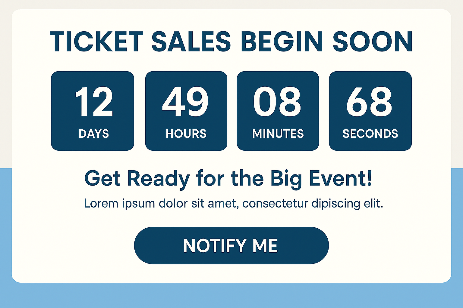
You know, sometimes you just need a little nudge to make a decision, right? That's exactly what building urgency and scarcity is all about for your event landing pages. It’s not about being pushy; it’s about tapping into that natural human tendency to act when something feels limited or time-sensitive. Think about it – when you see a great deal that’s ending soon, you’re more likely to grab it. We can use that same psychology to get more people to register for your event.
Early bird pricing is a classic for a reason. It rewards people who commit early and helps you gauge interest. Setting up a countdown timer right on your landing page makes that deadline super clear. It’s a visual cue that says, "Hey, this price won't last forever!" This simple addition can really push people over the edge from thinking about registering to actually doing it. It’s a small detail that makes a big difference in driving those initial sign-ups.
Nobody wants to miss out on something good. Announcing that tickets are selling fast or that there are only a certain number left creates a sense of competition. You can phrase it like, "Only 50 spots remaining!" or "Tickets are selling out quickly – don't wait!". This makes attendees feel like they need to act fast to secure their place. It’s a powerful way to encourage immediate action and avoid people putting off their registration indefinitely. Remember, scarcity and urgency are potent psychological triggers that can significantly increase sales. Check out more on scarcity.
Beyond just the event itself, you can create urgency around what happens after registration. Maybe you offer exclusive content, a private Q&A session with speakers, or early access to networking opportunities for those who sign up by a certain date. This adds another layer of incentive. It’s not just about getting into the event; it’s about getting more out of it by acting sooner rather than later. This can be a really effective way to motivate those on the fence.
So, we've talked about how the way you set up your event landing page really matters if you want people to sign up. It's not just about having the event details; it's about making it easy and convincing for someone to click that button. Think about where you put your main message, how clear the call to action is, and if people can quickly see what's in it for them. A well-organized page helps people decide faster. Try out different layouts, see what works best for your specific event and audience. Getting this right means fewer empty seats and a more successful event overall. It’s worth the effort to make your page work hard for you.
Think about what makes your event awesome! What will people gain by coming? Use simple words that grab attention and make people want to learn more. Your main title should tell them the biggest benefit right away.
Use really good pictures or videos that show what your event is all about. Make them big and clear. Graphics and icons can also help explain things quickly and make the page look more interesting.
Keep the sign-up form short and only ask for what you really need. Put the button to sign up in a place that's easy to see. Showing trust symbols, like security badges, helps people feel safe signing up.
Tell people why your event is special. Talk about the cool speakers and what makes your event different from others. Sharing what happy people have said about past events (testimonials) is also a great way to show value.
Make sure your page looks great and works well on phones and tablets. Pages that load super fast keep people from getting bored and leaving. Try out different versions of your page to see what works best.
Create a sense of urgency by using countdown timers for special deals or saying that tickets are running out. Offering special perks to those who sign up early can also encourage quick registration.
More blogs
Click the button below and finish your organizer registration, or fill out the form and we will be in touch to assist you.