


Register as an organizer
Click the button below and finish your organizer registration, or fill out the form and we will be in touch to assist you.
Think about your favorite band or music festival. Chances are, you can picture their logo, their colors, maybe even the vibe of their posters. That's Event Branding at work. It’s not just about making things look good; it’s about creating a feeling, a connection, that gets people excited *before* they even hear a single song. A strong visual identity acts like a magnet, drawing people in and making them want to be part of the experience. Let's explore how this works and why it's so important for selling tickets.
Think of your event's identity as its first handshake. It’s what people see, feel, and remember long before they even consider buying a ticket. Getting this right means you’re not just selling an event, you’re selling an experience, a feeling, a promise. It’s about creating something that sticks, something that makes people say, "Yeah, I want to be part of that." Without a solid identity, you’re just another flyer in the mail, easily overlooked.
What’s the one thing you want people to take away from your event? Is it about cutting edge innovation, pure escapism, community connection, or something else entirely? Your core message is the heart of your event, and everything else should flow from it. It’s not just a slogan; it’s the underlying reason your event exists. For example, a music festival might focus on discovering new artists, while a tech conference might highlight groundbreaking advancements. Pinpointing this message is the first step to building an identity that truly connects.
Once you know your core message, you need to give it a look and feel. Is your event sophisticated and sleek, or is it more playful and energetic? Think about the kind of vibe you want to create. This personality will guide your choices in everything from color schemes to the style of photography you use. A serious, academic conference will look very different from a family-friendly fair, and that’s exactly how it should be. Your visuals need to speak the same language as your event’s purpose.
Your logo is often the very first visual touchpoint people have with your event. It’s the face of your brand, and it needs to be instantly recognizable and memorable. A strong logo does more than just identify; it communicates your event’s personality and can even hint at its core message. Studies show that color and design significantly influence first impressions, with colorful logos boosting recognition. Think of iconic logos, they’re simple, unique, and immediately tell you what they represent. A well-designed logo can make your event stand out in a crowded market, making it easier for people to find and remember you.
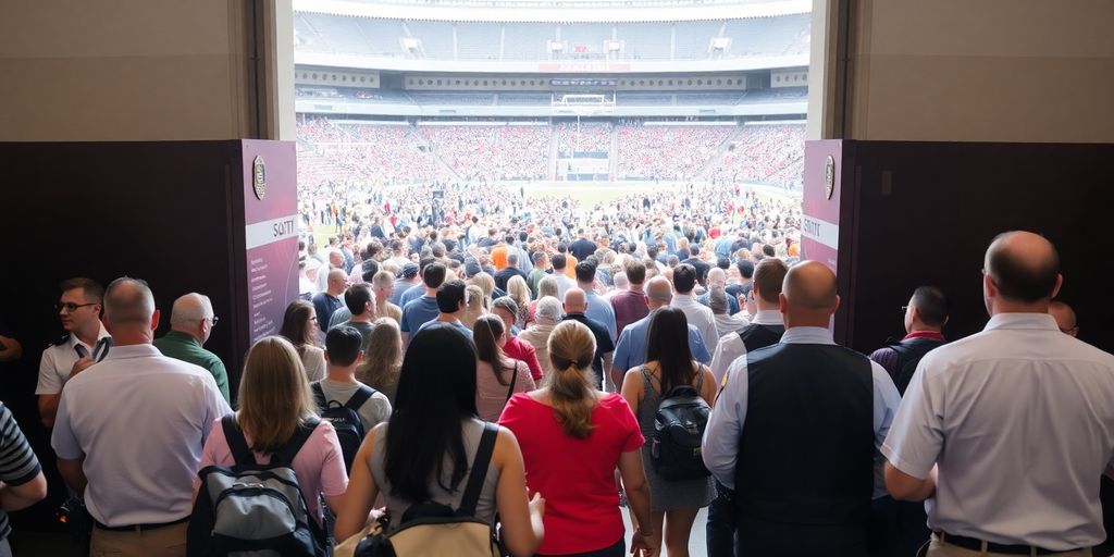
When people first encounter your event, they don't know your music or your vibe yet. What they do see is your visual branding. This is how they form their first impressions, and honestly, it’s a big deal. Think about it, if a poster looks sloppy or a website is hard to navigate, you might just scroll past, right? It’s not about being judgmental, it’s about how our brains are wired. We process visuals incredibly fast, and they trigger feelings before we even read a word.
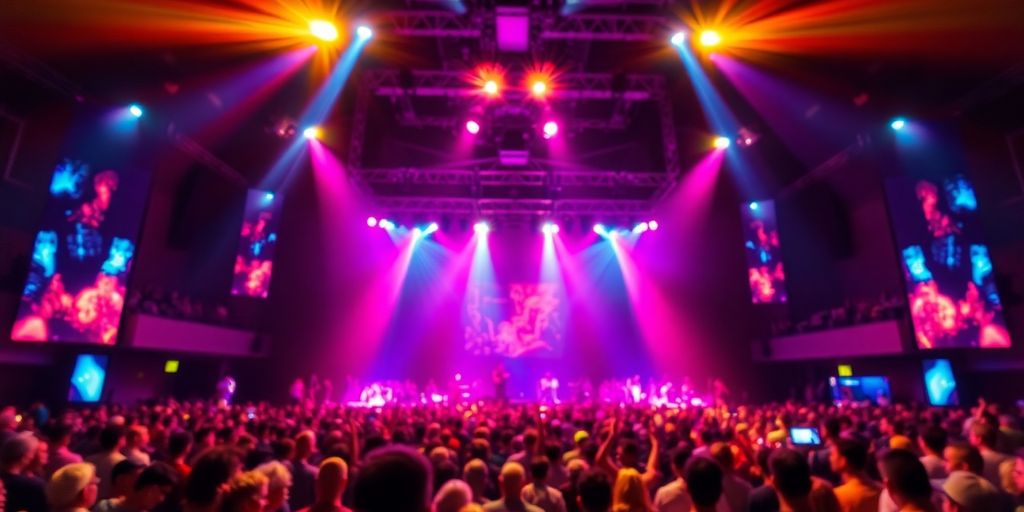
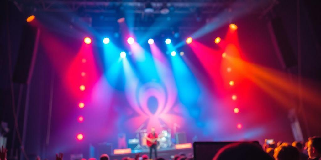
Visuals speak a language all their own, one that bypasses logic and goes straight for the gut. A well designed poster or a striking social media graphic can make someone feel excited, curious, or even nostalgic, all in a split second. This emotional hook is what makes people stop and pay attention. It’s like meeting someone for the first time; their appearance and demeanor give you an immediate sense of who they are and whether you want to get to know them better. Your event’s visuals do the same thing for potential attendees.
Let’s be real, a polished visual identity signals professionalism. If your event looks put-together and thoughtfully designed, people are more likely to believe it will be well-organized and deliver a great experience. Conversely, a weak or inconsistent visual presence can make people hesitant. They might wonder if the event itself will be similarly disorganized. It’s about showing you care about the details, which builds confidence.
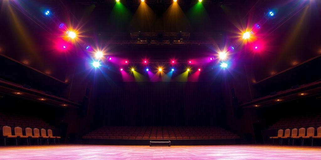
Your visuals are like the opening act for your event. They set expectations and hint at what’s to come. Are you going for a high-energy, modern feel? Or perhaps something more intimate and classic? The colors, fonts, and imagery you choose all contribute to this narrative. They tell a story about the kind of atmosphere attendees can expect, helping them decide if it’s the right fit for them.
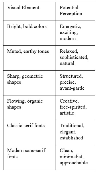
Here’s a quick look at how different visual elements can influence perception:
So, you’ve got this killer event concept, right? And you’ve nailed down the look and feel, the colors, the fonts, the whole vibe. Now, how do you get that message out there so people actually pay attention and, more importantly, buy tickets? That’s where your visual identity really gets to work across all your advertising.
Think about it: a poster on a lamppost, a banner ad on a website, a social media graphic, they all need to grab someone’s attention fast. What works on a giant billboard might look cluttered on a tiny phone screen. You need to make sure your visuals are clear and impactful, no matter where they show up. Your visual identity needs to be adaptable without losing its core message. For print, you might go for bolder colors that pop off the page, and maybe a more classic font that’s easy to read from a distance. Digital is a bit different, you’ve got animation possibilities, interactive elements, and the need to load quickly. Colors can sometimes look different on screen than they do on paper, too, so you have to account for that. It’s about making sure the essence of your brand comes through, whether it’s a physical flyer or a sponsored post.
Don’t just create a logo and a color scheme and call it a day. You’ve got a whole toolkit of visual elements. That cool pattern you designed for your website? Turn it into a background for your social media posts. That striking photo from a past event? Crop it, add text, and use it in an email campaign. It’s like having building blocks, you can rearrange them to create something new but still instantly recognizable as yours. This saves you time and money, and it keeps your brand looking consistent everywhere. It’s all about getting the most mileage out of the creative work you’ve already done.
This is super important. Imagine seeing an ad for your event with one style, then getting an email with a completely different look. It’s confusing, right? People might start to wonder if it’s even the same event. You need a set of guidelines, think of it like a style bible for your brand. This guide should spell out exactly how to use your logo, which fonts to use for headlines versus body text, and what the approved color palette is. It helps everyone on your team, or any designers you work with, stay on the same page. This way, every single ad, every social post, every email feels like it’s coming from the same place, building that trust and recognition we talked about earlier. It makes your event feel more professional and reliable.
When you’re putting your event out there, consistency is key. It’s not just about looking good; it’s about building a recognizable presence that people can trust. Every piece of advertising, from a tiny social media icon to a huge billboard, should feel like it belongs to the same event. This builds familiarity and makes people more likely to remember and engage with your brand.
Think about your favorite band or a festival you really want to go to. Chances are, you can picture their logo or the general vibe of their promotional materials pretty easily, right? That's not an accident. The colors and fonts used in an event's branding play a huge part in how people feel about it before they even hear a single song.
Colors have a direct line to our emotions. A bright, energetic yellow might make you think of a summer music festival, while deep blues and purples could suggest a more sophisticated, intimate concert. Picking the right colors isn't just about making things look pretty; it's about setting a mood. Most brands stick to a few core colors to make sure everything looks consistent. This usually means a main color, a secondary one for backgrounds, and maybe an accent color to make important things pop.
Even black and white can be powerful choices. The key is to pick colors that match the feeling you want your event to have.
Just like colors, the fonts you choose say a lot. A bold, blocky font might feel strong and modern, while a flowing script font could feel more classic or artistic. Using too many different fonts can get messy and confusing, though. It's usually best to pick one or two fonts that work well together, one for headlines and another, more readable one for the main text. This consistency helps people recognize your event's materials instantly.
The right font can make a headline feel exciting or a description feel trustworthy. It’s a subtle but important part of the overall message.
Putting it all together means making sure your colors and fonts work hand in hand across everything you produce. Whether it's a poster, a social media post, or even the signage at the venue, the visual style should be the same. This consistency builds recognition and trust. Think about how some brands are so recognizable just by their color and font, that's the goal for your event too. It helps people feel like they know what to expect, even before they've bought a ticket.
Think of your event's visual identity as the silent narrator. It’s what people see and feel before they even know the full story of your event. A strong visual narrative can pull people in, making them curious and eager to learn more. It’s about showing, not just telling, what your event is all about. This means every color choice, every font, and every image should work together to communicate a clear message and evoke a specific feeling.
Your event has a story to tell, maybe it's about innovation, community, or pure entertainment. Your visuals need to reflect that. Are you aiming for a sophisticated, elegant vibe, or something more energetic and casual? The way you present your event visually should immediately give people a sense of its core purpose and atmosphere. It’s like casting a character for a play; the visuals are the costume and set design that tell you who they are and what kind of story to expect.
This is where the magic happens. Instead of writing long descriptions about how exciting your event will be, let your visuals do the talking. A dynamic photo, a bold color scheme, or a unique graphic element can convey excitement far more effectively than words alone. For instance, if your event is about cutting-edge technology, sharp lines and a futuristic color palette will communicate that much faster than a paragraph explaining it. The goal is to create an immediate emotional connection through what people see.
To build a truly compelling visual story, consider these points:
Your visual identity is the first handshake your event offers. Make it memorable, make it meaningful, and make sure it tells the right story from the very first glance. It’s about creating an impression that sticks, long after the initial viewing.
Think about it, your event’s visual identity isn't just going to live on a single poster or website. It needs to show up everywhere your potential attendees might be. This means adapting your look and feel so it works well whether someone sees it on a tiny phone screen, a giant billboard, or even printed on a t-shirt. Getting this right means your brand feels familiar and professional, no matter where people encounter it.
Digital spaces are where most people will first see your event. This includes social media feeds, online ads, email newsletters, and your event website. For these platforms, clarity and quick impact are key. Colors might need to be brighter to pop on screens, and fonts need to be easy to read even at small sizes. Think about how your logo looks as a tiny profile picture versus a large banner. It’s all about making sure the essence of your brand comes through, even when the format changes.
When your visual identity moves into the real world, like at the venue itself, it’s a different ballgame. You can play with textures, larger-than-life graphics, and even how people interact with signage. A bold color that looks great online might need a slight tweak for print to avoid looking dull. The goal here is to create an immersive experience that matches the digital impression, making the physical space feel like a natural extension of your brand.
Screens come in all shapes and sizes, from a smartwatch to a large monitor. Your visuals need to be flexible. This means creating versions of your graphics that scale well. A complex illustration might be simplified for a smaller screen, or a wide banner might need to be cropped or reformatted for a vertical mobile view. It’s about ensuring legibility and impact across the board.
Making sure your visual identity looks good everywhere isn't just about making it pretty, it's about making it work. If people can't read your event details on their phone or if the colors look off on a banner, they might just miss out or get a bad impression. It’s practical design for real world use.
Keeping your event's visual identity sharp and recognizable is a marathon, not a sprint. It’s about making sure that whether someone sees your event on a giant billboard or a tiny Instagram story, it feels like the same thing. Consistency is the bedrock of a strong brand, but that doesn't mean you can't let it grow a little. Think of it like a favorite song; you love the original, but maybe a new arrangement or a live version adds something fresh without changing the core melody.
Consistency builds trust, your fans should instantly recognise your event brand at a glance. But if every poster, ticket, and ad looks exactly the same year after year, your brand can start to feel outdated or uninspired. The key is to evolve without losing your core identity.
Think of it like giving your brand a seasonal wardrobe refresh. Keep your logo, colours, and overall tone consistent, but play with small updates that add excitement, fresh typography, new imagery styles, or a limited edition colour accent.
A great example is Google’s doodles, the logo stays recognisable, but the playful updates keep people engaged and curious. Your event can do the same, keep the foundation familiar so fans feel connected, but add just enough change to make each season or edition feel new.
The goal is to strike a balance, predictable enough to feel trustworthy, fresh enough to spark interest.
So, really, it’s not just about having a cool logo or pretty colors. It’s about creating a whole feeling around your event before anyone even buys a ticket. When your visual identity is strong and consistent, it tells people who you are and what to expect. It builds trust and makes people feel connected, even before the music starts. Think of it like a good handshake, it sets the tone. Get that right, and you’re already halfway to a sold-out show. It’s about making people feel something, so they want to be there.
Think of your event's visual identity like its outfit. It's what people see first! A cool logo, nice colors, and a clear style make people remember your event and feel excited about it, even before they know all the details.
When your event's visuals are consistent everywhere, like on posters, social media, and tickets, people start to trust it. It shows you're organized and professional, making them more likely to buy tickets.
Colors and fonts are like the event's personality. Bright colors might mean a fun party, while elegant fonts could suggest a more serious show. Choosing the right ones helps people know what to expect and if it's for them.
Your visuals should tell a story about your event. For example, pictures of happy crowds or exciting performances can show people what the experience will be like, making them want to be part of it.
Yes, you need to make sure your event's look works well on different screens, like phones and computers, and also in real life, like on banners or signs. The main idea should stay the same, but it might need small changes to look good everywhere.
It's good to keep your event's look consistent over time, but you can also update it a bit to keep it fresh. The key is to make sure it always feels like the same event, even as it grows or changes slightly.
More blogs
Click the button below and finish your organizer registration, or fill out the form and we will be in touch to assist you.