


Register as an organizer
Click the button below and finish your organizer registration, or fill out the form and we will be in touch to assist you.

Getting tickets for an event should be easy, right? But sometimes, it feels like a real hassle. This article looks at how we can make the whole process, from first looking for tickets to actually getting into the event, much smoother. We'll talk about how good design and smart technology can make buying tickets less of a headache for everyone.
Before anyone even thinks about buying a ticket, there's a whole process they go through. It's more than just finding an event; it's about making the entire experience smooth and easy. If this part isn't done well, people might just give up before they even get to the checkout. Let's look at how to make this initial stage better.
Finding the right event should be simple. Think about how people search for things online. Are they using keywords? Are they browsing by category? The easier it is to find what they're looking for, the better. A good search function is key, and clear categories help a lot. Consider these points:
Event discovery is more than just a search bar; it's about guiding users to the experiences they'll love. Think about personalized recommendations and intuitive browsing options.
Ticketing platform contracts can be confusing. It's important to know what you're agreeing to before you start selling tickets. This includes fees, payout schedules, and any restrictions on ticket sales. Here's a quick rundown:
How are you getting the word out about your events? Are you using social media, email, or other channels? It's important to use the right channels and tailor your message to each one. Think about where your target audience spends their time online. For example, you can optimize critical user journeys to improve the marketing flow. Here are some ideas:

Let's be real, buying tickets online can be a pain. You're excited about an event, but the process itself? Not so much. This section is all about making that purchase experience way better.
Think about the last time you bought tickets online. Was it easy? Could you find what you needed quickly? A good interface is key. It's got to be clean, simple, and guide you through the process without making you want to throw your computer out the window. Clear calls to action, easy-to-understand layouts, and mobile-friendly designs are all part of the puzzle. No one wants to hunt for the "buy tickets" button.
Okay, you've picked your tickets. Now comes the checkout. This is where things often fall apart. Long forms, confusing payment options, and surprise fees can kill the excitement fast. A smooth checkout means:
Streamlining the checkout isn't just about speed; it's about building trust. People are more likely to complete a purchase if they feel the process is transparent and secure.
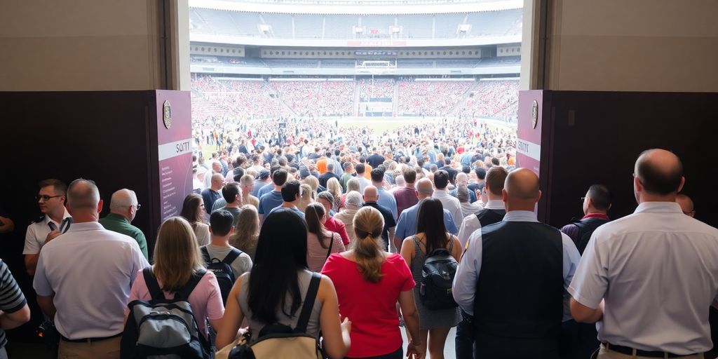
Ever tried buying tickets for a super popular event the second they go on sale? Website crashes, error messages, pure chaos. Digital queues are a way to handle that rush. Instead of everyone flooding the site at once, people are placed in a virtual line. It's not perfect, but it's way better than a complete meltdown. The key is to make the queue experience as painless as possible:
Here's a simple way to think about it:

Ticket fraud is a growing concern, and mobile apps are stepping up as a key defense. Using mobile tickets accessed through a dedicated app is becoming a standard measure to fight fraud. These apps discourage static screenshots and often work offline, adding layers of security. Plus, many platforms offer digital ticket transfer systems, letting users easily send tickets to someone else securely through the app or website. This eliminates the need for physical tickets and makes things way easier.
Static tickets are easy to copy, but dynamic codes change regularly, making them much harder to counterfeit. These codes, often QR codes that refresh every few seconds, ensure that a ticket can only be used once. This technology adds a significant hurdle for fraudsters. It's a simple change that makes a big difference in keeping events secure.
Getting users to adopt mobile ticketing is easier when the process is smooth. When someone buys a ticket and views it from their email or the confirmation page, they're usually sent straight to the app store via a deep link if they don't already have the app. To make it even easier, the email address used during the purchase process is automatically filled in, saving time and hassle. This integration encourages app use and boosts security.
Making the move to digital ticketing isn't just about convenience; it's about creating a safer experience for everyone. By using mobile apps, dynamic codes, and smooth app integration, ticketing platforms can greatly reduce fraud and give users peace of mind.
Once someone buys a ticket, it's not the end of the road! It's a chance to show them even more cool stuff they might like. Think about it: they're already excited about an event. Why not suggest similar events, merchandise, or even VIP upgrades?
Post-purchase is a great time to offer a small discount code for future purchases. It encourages repeat business and shows appreciation for their initial purchase.
Users need a simple way to access and manage their tickets. No one wants to dig through emails or create an account just to find their tickets. A dedicated section within the platform is key.
Keep the excitement going! Use the post-purchase period to let people know about other events they might be interested in. This is a prime opportunity to turn one-time attendees into loyal fans.
It's super important that your ticketing platform works great no matter what device someone is using. People might be buying tickets on their phone, tablet, or computer, and the experience needs to be smooth and consistent across all of them. This means thinking carefully about how the platform looks and functions on different screen sizes and operating systems.
Responsive design for web and mobile is key. Your website should automatically adjust to fit the screen it's being viewed on. This isn't just about making things look good; it's about making them usable. Buttons need to be big enough to tap on a phone, text needs to be readable, and forms need to be easy to fill out. If your site isn't responsive, you're going to lose customers who get frustrated trying to use it on their phones.
Imagine someone starts browsing for tickets on their computer at home, then decides to buy them on their phone while they're out. The process should feel the same, no matter which device they're using. This means:
A unified experience builds trust and reduces confusion. If users have to re-learn how to do something every time they switch devices, they're less likely to complete their purchase.
Accessibility is about making sure everyone can use your platform, including people with disabilities. This includes:
Accessibility isn't just a nice-to-have; it's the right thing to do, and it can also improve overall platform functionality for all users.
It's super important to see what other ticketing platforms are doing right (and wrong!). This helps us make our platform even better. We're not just looking at the surface; we're digging into the details of how they work, what users like, and what could be improved. This isn't about copying; it's about learning and innovating.
We need to see how we stack up against the big players. This means looking at things like ease of use, features, and overall user satisfaction. Benchmarking involves comparing our platform against industry leaders like Ticketmaster, StubHub, and SeatGeek. It's not just about features; it's about the whole experience. For example, we can look at the online event ticketing market and see how they are growing.
How do other platforms organize their events? Is it easy to find what you're looking for? How do they present information about events, venues, and tickets? These are key questions. AXS, for example, has well-defined categorization, which makes it easy for users to find what they need. We need to make sure our platform is just as intuitive, if not more so.
Seat maps can make or break the ticket buying experience. Are they clear? Are they accurate? Do they provide enough detail? SeatGeek is known for its seat view maps and comprehensive information. We can learn a lot from how they do it. A good seat map can really enhance the overall success of the event.

Let's face it, no platform is ever perfect right out of the gate. There's always room to grow, to tweak, and to make things better for the people using it. When it comes to ticketing, that means constantly looking for ways to smooth out the experience and make it more intuitive. It's not just about having a functional platform; it's about having one that people actually enjoy using.
Good navigation is the backbone of any successful platform. If people can't find what they're looking for, they're going to get frustrated and leave. It's that simple. Think about clear menus, logical categories, and maybe even a helpful search bar that actually understands what users are trying to find. No one wants to feel like they're wandering through a maze just to buy a ticket.
Information architecture is all about how the content is organized and presented. Is it easy to understand? Is the important stuff front and center? Or is it buried under layers of unnecessary fluff? A well-organized platform makes it easy for users to find the details they need, like event times, locations, and IT ticketing systems, without having to hunt for it.
The best way to improve a platform is to listen to the people who are actually using it. User feedback is gold. Whether it's through surveys, reviews, or even just watching how people interact with the platform, there are always insights to be gained. Don't be afraid to ask for feedback and, more importantly, actually act on it.
Here are some ways to gather user feedback:
So, we've talked a lot about making ticket buying and using them super easy. It's really about making sure people have a good time from when they first look for tickets all the way until they walk into the event. Things like clear websites, simple steps to buy, and easy-to-use digital tickets make a big difference. When companies put effort into these details, everyone wins. Customers are happy, and the companies do better too. It's just smart business to make things as smooth as possible for everyone involved.
Making the ticket buying process easy means designing websites and apps that are simple to use. This includes clear buttons, easy-to-understand steps, and making sure the checkout goes smoothly. The goal is to make it super simple for anyone to buy a ticket without getting confused or frustrated.
When lots of people try to buy tickets at the same time, it can crash a website. Digital queues are like virtual waiting lines. They help manage all those people so the website doesn't get overloaded. Everyone gets a turn, which makes buying tickets fairer and keeps the system from breaking down.
Ticket fraud is when fake tickets are sold. Mobile apps help stop this by using special codes that change often, making them hard to copy. Also, the app can check who you are, which adds another layer of safety. This way, you know your ticket is real.
After you buy a ticket, companies can show you other things you might like, like parking passes or merchandise (cross-selling). They might also offer better seats or VIP packages (upselling). This usually happens right after your purchase, or when you log back into the app to manage your tickets.
It's super important for ticketing websites and apps to work well on all devices, like phones, tablets, and computers. This means the design changes to fit the screen size, so it's always easy to see and use, no matter what device you're on.
Benchmarking means looking at what other successful ticket companies do well. For example, some might have great seat maps that show you exactly where you'll be, or really clear ways to find events. Learning from them helps us make our own platform even better.
More blogs
Click the button below and finish your organizer registration, or fill out the form and we will be in touch to assist you.