


Register as an organizer
Click the button below and finish your organizer registration, or fill out the form and we will be in touch to assist you.
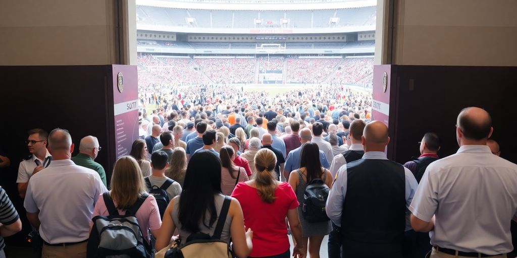
Buying tickets online can sometimes feel like a chore, right? You find the event you want, click to buy, and then... a long form, confusing steps, or maybe a mandatory account creation. It’s frustrating. This article looks at how XTIX can make buying tickets smoother. We’re talking about ticket checkout optimization, making it easier for people to get their tickets and for XTIX to sell more. Let's get into it.

When people want to buy tickets for an event on XTIX, the whole process should feel easy, not like a chore. We need to look at how someone actually goes from seeing an event they like to having the ticket in their hand. It’s all about making that path as smooth as possible. If it’s complicated, people just leave.
First off, let's map out what a typical user does. Where do they click? What pages do they visit? Are they getting stuck anywhere? We need to see the whole journey, from the event listing to the confirmation email. Think of it like following breadcrumbs. We want to make sure those breadcrumbs lead directly to a completed purchase, without any confusing detours.
After we know the path, we have to find the sticky spots. These are the places where users slow down, hesitate, or just give up. Maybe it’s a confusing page layout, a form that asks for too much info, or a button that’s hard to find. We need to pinpoint these problems.
Here are some common bottlenecks:
Nobody likes filling out long forms. For XTIX, we should only ask for what’s absolutely necessary to complete the ticket purchase. If we can get the info we need with fewer fields, we should do it.
Consider this:
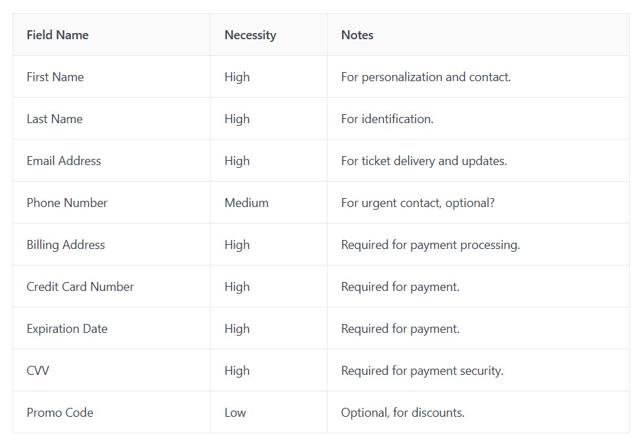
Asking for too much information upfront can really turn people off. It makes the process feel longer and more intrusive than it needs to be. Keep it lean.
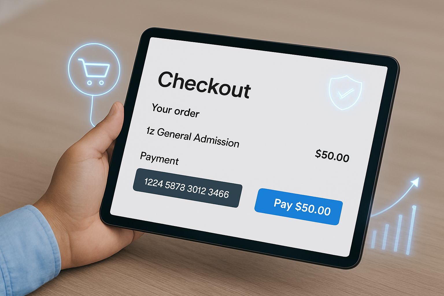
Getting paid is obviously important, but how you do it really matters for the customer. If the payment part of buying tickets feels like a chore, people will just leave. We want to make it super easy and trustworthy.
Not everyone uses the same payment method. Some people like credit cards, others prefer digital wallets like Apple Pay or Google Pay, and some might even want to use services like PayPal. Offering a variety of ways to pay means more people can finish their purchase without a hitch. It’s about meeting customers where they are. Think about it: if your favorite payment method isn't there, you might just look elsewhere for your tickets.
People are rightly careful about their financial information online. We need to show them that XTIX is a safe place to enter their card details or connect their digital wallet. This means having clear security badges, using trusted payment gateways, and making sure the whole process looks professional and secure. Building trust at this stage is non-negotiable. A little padlock icon or a clear statement about data protection can go a long way in making customers feel comfortable. You can find more information on building trust in online transactions here.
Every extra click or field a customer has to fill out is another chance for them to get frustrated and leave. We should aim to cut down the number of steps needed to complete a payment. This could involve pre-filling information for returning customers or using smart forms that only ask for what’s absolutely necessary. The goal is to get them from selecting their seats to having their tickets in hand as quickly as possible.
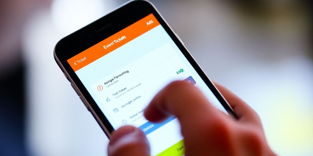
A long checkout process is one of the fastest ways to lose potential ticket buyers. That’s where guest checkout comes in. By allowing fans to purchase tickets without creating an account, you remove unnecessary friction and give them a faster, more convenient way to complete their order. The easier it is to check out, the more likely fans are to finalise their purchase, and the higher your chances of boosting attendance.
Lots of people just want to grab their tickets and go, right? They don't want to mess with creating an account every single time they buy something. Guest checkout is the answer. It lets users bypass the signup process entirely. This means fewer clicks, less typing, and a much faster path from wanting a ticket to actually having it. Think about it: if someone's on their phone, maybe waiting in line for another event, they're not going to want to fill out a whole registration form. They just want the ticket. Making this option front and center can really speed things up. It’s a simple change that can make a big difference in getting those sales completed. We saw a noticeable jump in completed purchases when we made guest checkout the default option for first-time buyers.
Forcing users to create an account before they can buy can be a real turn-off. It feels like extra work, and honestly, most people don't want another login to remember. It’s like asking them to sign a petition just to buy a coffee. This friction point can lead to a lot of abandoned carts. Instead, focus on making the purchase itself the main event. You can always offer account creation after the sale is complete, perhaps with a simple checkbox like, "Save my details for next time?" This way, users get their tickets quickly, and if they like the experience, they might choose to create an account later. It’s about removing obstacles, not adding them. A good conversion rate is often between 2-4%, and reducing these barriers helps achieve that target.
Even if someone checks out as a guest, they still need access to their tickets and order information. Don't leave them hanging! After the purchase is done, provide a clear link or button that says something like, "View My Tickets" or "Access Order Details." This link can take them to a temporary order summary page. For those who might want to track their purchase history or easily re-access tickets later, you can offer a simple option to create an account using the details they just provided. A quick "Create an Account" button right there on the confirmation page makes it super easy. This way, guests still get the benefits of an account without the upfront hassle.
So, you've got people on your site, ready to buy tickets, but they're mostly on their phones. That's pretty common these days, right? If your mobile checkout is a pain, you're losing sales, plain and simple. We need to make it easy for folks to grab tickets when they're out and about.
Think about it: a tiny screen means less space for everything. We can't just shrink down a desktop page and call it good. Buttons need to be big enough to tap without hitting the wrong thing. Text needs to be readable without zooming in constantly. Forms should be simple, asking only for what's absolutely necessary. It's all about making sure the important stuff, like event details and the 'buy' button, is front and center. A good mobile site feels like it was built for your phone, not just adapted.
Typing on a phone keyboard can be slow, and accidentally hitting the wrong button is super annoying. We need to make sure interactive elements are spaced out well. Think about using things like steppers for quantity instead of typing numbers, or dropdowns that are easy to select from. Swipe gestures can sometimes be useful, but only if they're intuitive and don't conflict with other actions. Making sure every tap does what the user expects is key. It's about reducing frustration and making the whole process feel quick and effortless.
This is kind of a given, but it's worth repeating. Your website needs to look and work well on any device, from a small smartphone to a big tablet. That means the layout should adjust automatically. Images should scale properly, and text should reflow so it's always easy to read. We want people to have a good experience whether they're using an iPhone, an Android, or something else entirely. A site that's responsive means you don't have to build a separate mobile app just to get sales on the go. It's about making sure your online ticketing platforms prioritize user experience by simplifying the ticket purchasing process and minimizing friction. A well-designed platform enhances usability and ensures a smooth transaction for customers.
We need to remember that for many users, their phone is their primary way of accessing the internet. If that experience isn't smooth, they'll just go somewhere else. It's that simple.
Even the best event promotion can fall flat if fans don’t know what action to take next. That’s why clear call-to-actions (CTAs) are essential. A well-placed and compelling CTA, whether it’s “Buy Tickets Now,” “Save Your Spot,” or “Get Early Access”, guides fans directly toward purchase with no second guessing. When your CTAs are easy to spot and straightforward, you reduce hesitation and keep the momentum moving toward attendance growth.
When someone is ready to buy, you want to make it super obvious what they should do next. Think of it like a signpost on a busy street. Without clear directions, people get lost or just give up. On XTIX, this means having a prominent button that says something like "Buy Tickets Now" or "Complete Purchase." It shouldn't blend in with everything else; it needs to stand out. We're talking about making that next step as easy to spot as possible. It’s about removing any guesswork so users can move forward without hesitation. A well-placed button can really make a difference in getting that sale.
What you say on your buttons matters. Instead of vague phrases, use words that tell people exactly what will happen. "Add to Cart" is good, but "Add to My Cart" feels a bit more personal. For XTIX, consider phrases like "Get My Tickets" or "Secure My Spot." These words create a sense of ownership and urgency. They prompt action. It’s not just about telling people what to do, but making them want to do it. Think about the feeling you want to evoke – excitement, certainty, or maybe just simple convenience. The right words can tap into that.
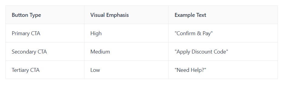
Not all buttons are created equal, and your checkout page should reflect that. You need a clear visual order so users know which action is most important. The primary "Checkout" or "Pay Now" button should be the most visually dominant element on the page. This might mean using a contrasting color, a larger size, or a bolder font. Secondary actions, like "Continue Shopping" or "Save for Later," should be less prominent. This way, users aren't distracted from the main goal: completing their purchase. It’s like having a spotlight on the most important action. Making sure the main call-to-action is clear helps users complete their purchase on XTIX without getting sidetracked.
Here’s a quick look at how button hierarchy can work:
Personalization can really make a difference in how people feel about buying tickets. It’s not just about getting the sale; it’s about making the customer feel seen and understood. When the checkout process feels tailored to them, they’re more likely to complete the purchase and even come back for more events.
Think about it: if someone frequently buys tickets for concerts, wouldn't it be great if the system remembered their favorite artists or genres? XTIX can do this by saving past purchases and browsing history. This means when they return, we can show them events they’re genuinely interested in, right from the start. It cuts down on searching and makes the whole experience feel more personal. We could even save their preferred seating sections or ticket quantities.
Upselling isn't just about pushing more expensive tickets. It’s about offering things that genuinely add value to the customer’s experience. Maybe someone just bought a ticket to a big festival. We could offer them a VIP upgrade, parking passes, or even merchandise related to the headlining act. The key is to make these suggestions feel helpful, not pushy. It’s about anticipating what they might want next, based on their current purchase. For instance, if they buy a family show ticket, perhaps a discount on concessions or a special kids' package would be a good addition. This is a great way to boost the average order value and give customers a better overall experience, as detailed in this guide to optimizing your checkout process checkout conversion rates.
This goes hand-in-hand with remembering preferences. Instead of just showing a generic list of upcoming events, we can curate recommendations based on what we know about the user. If they’ve bought tickets to several jazz concerts, we should be showing them more jazz events, or perhaps similar genres like blues. This makes the user feel like XTIX 'gets' them. It’s like having a personal ticket concierge. We can present these recommendations in a dedicated section during checkout, or even in follow-up emails. It’s all about making the discovery process easier and more enjoyable for the customer.
So, we've talked about a bunch of ways to make buying tickets on XTIX easier. Cutting down on steps, making sure forms are simple, and just generally removing any roadblocks can really make a difference. When people can get their tickets without a hassle, they're way more likely to actually buy them. It’s not rocket science, but it does take paying attention to the little things. By focusing on a cleaner checkout process, XTIX can definitely see more people completing their purchases, which is good for everyone involved. Let's keep making it simple.
Making it easier to buy tickets means cutting out any annoying steps. We look at how people buy tickets now, find where they get stuck, and then fix those spots. We also make sure forms are short and only ask for what's really needed.
We want to make paying super fast and simple. This means giving you lots of ways to pay, like credit cards or digital wallets, and making sure you feel safe doing it. Fewer clicks and less typing means you get your tickets quicker.
You can buy tickets without making an account! This is great if you're in a hurry. You still get all the ticket info sent to you after you buy, so you don't miss out.
Buying tickets on your phone should be a breeze. We make sure the buttons are big enough to tap, the text is easy to read, and everything fits nicely on your screen. It's designed to work smoothly on any phone.
Clear buttons that tell you exactly what to do, like 'Buy Now' or 'Get Tickets', are super important. We make these buttons stand out so you know exactly where to click to finish your purchase. It's all about guiding you smoothly to the finish line.
We can remember what you like or what you've bought before. This helps us show you tickets you might be interested in or suggest cool add-ons, making your ticket buying experience more personal and helpful.
More blogs
Click the button below and finish your organizer registration, or fill out the form and we will be in touch to assist you.