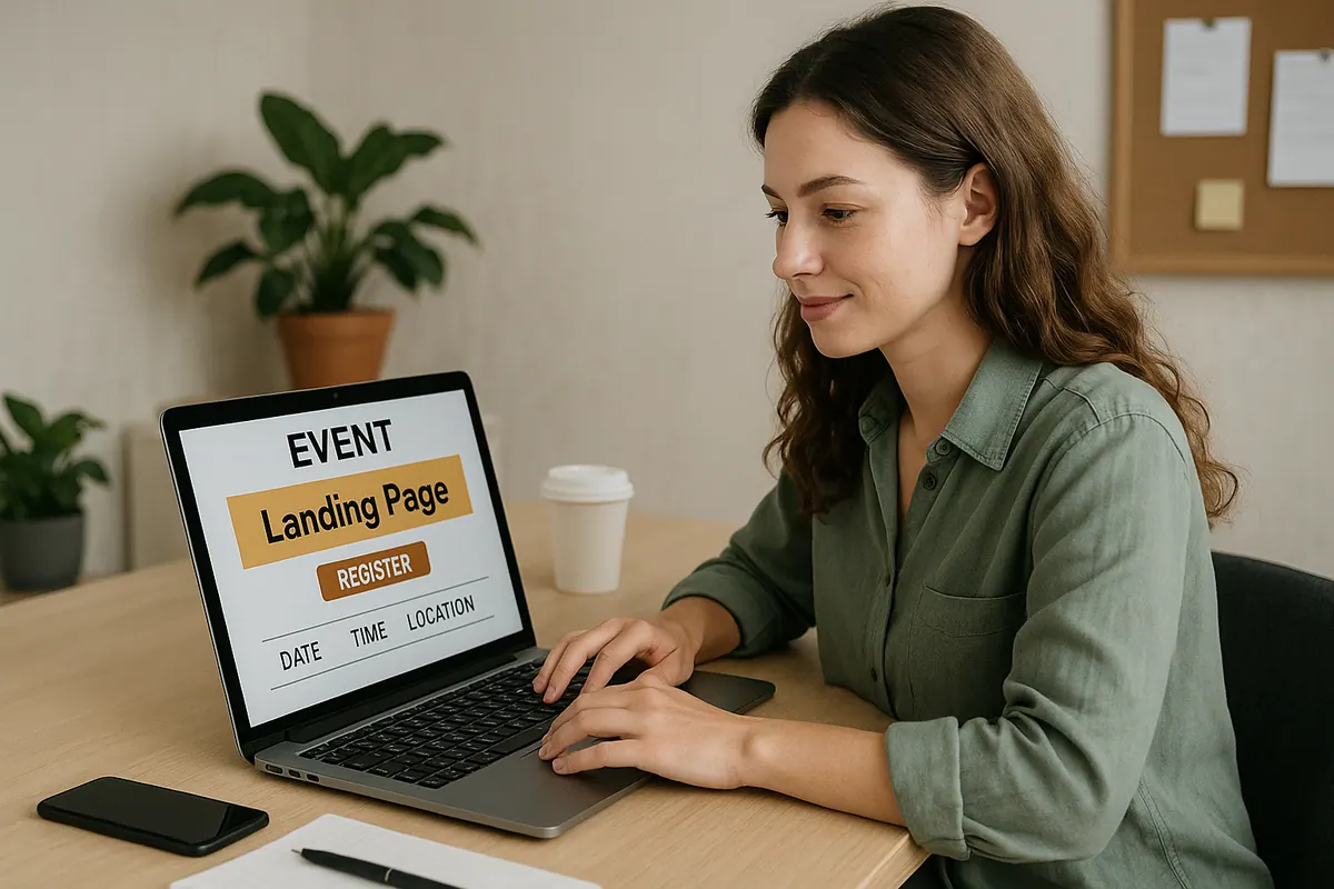
So, you're putting together an event and need a landing page that actually gets people to sign up, right? It's not just about having a page; it's about making that page work for you. We're talking about event landing page best practices here, specifically what needs to be visible right away, before anyone has to scroll. Getting those first few seconds right can make a huge difference in whether people click that 'buy' or 'register' button.
Key Takeaways
- Make your main headline super clear about what the event is and why someone should care. Use words that show what attendees will get out of it.
- Your main picture or video needs to be good quality and match the event. It should make people feel something about attending.
- Have a button that stands out. It should tell people exactly what to do, like 'Register Now,' and be a color that grabs the eye.
- Put important info like the date, time, and where it's happening (or if it's online) right where people can see it without searching.
- Show that other people trust your event. This could be quotes from past attendees, logos of companies you work with, or how many people are already signed up.
Compelling Headline That Grabs Attention
Your event's headline is the very first thing people see when they land on your page. It's got to be good, like, really good. Think of it as the handshake for your event, make it firm and memorable. It needs to tell people instantly what your event is about and why they should care. No one wants to spend time figuring out if your event is for them. If it's confusing, they're just going to bounce. So, let's break down what makes a headline work.
Clarity On Event Purpose
What exactly is happening? Is it a conference, a workshop, a festival, a webinar? Be direct. Instead of something vague like "Innovate Your Future," try "Annual Tech Conference: AI in Business." This tells people immediately if it's relevant to their interests. It’s about cutting through the noise and getting straight to the point. Think about what problem your event solves or what experience it offers. That's the core of your message.
Benefit-Oriented Language
People sign up for events because they want something out of it. What will attendees gain? Will they learn a new skill, meet industry leaders, get inspired, or find solutions to their problems? Frame your headline around these benefits. For example, "Master Digital Marketing in One Day" is much stronger than "Digital Marketing Seminar." It highlights the outcome for the attendee. Consider what makes your event stand out and focus on that positive change.
Concise And Actionable
Keep it short and sweet. Long, rambling headlines get ignored. Aim for clarity and impact. Ideally, your headline should be easily scannable. Think about what action you want people to take after reading it, usually, it's to learn more or register. While the headline itself isn't the button, it should lead naturally to that next step. A good headline makes people want to keep reading and find out more about your event details.
Visually Appealing Hero Image Or Video
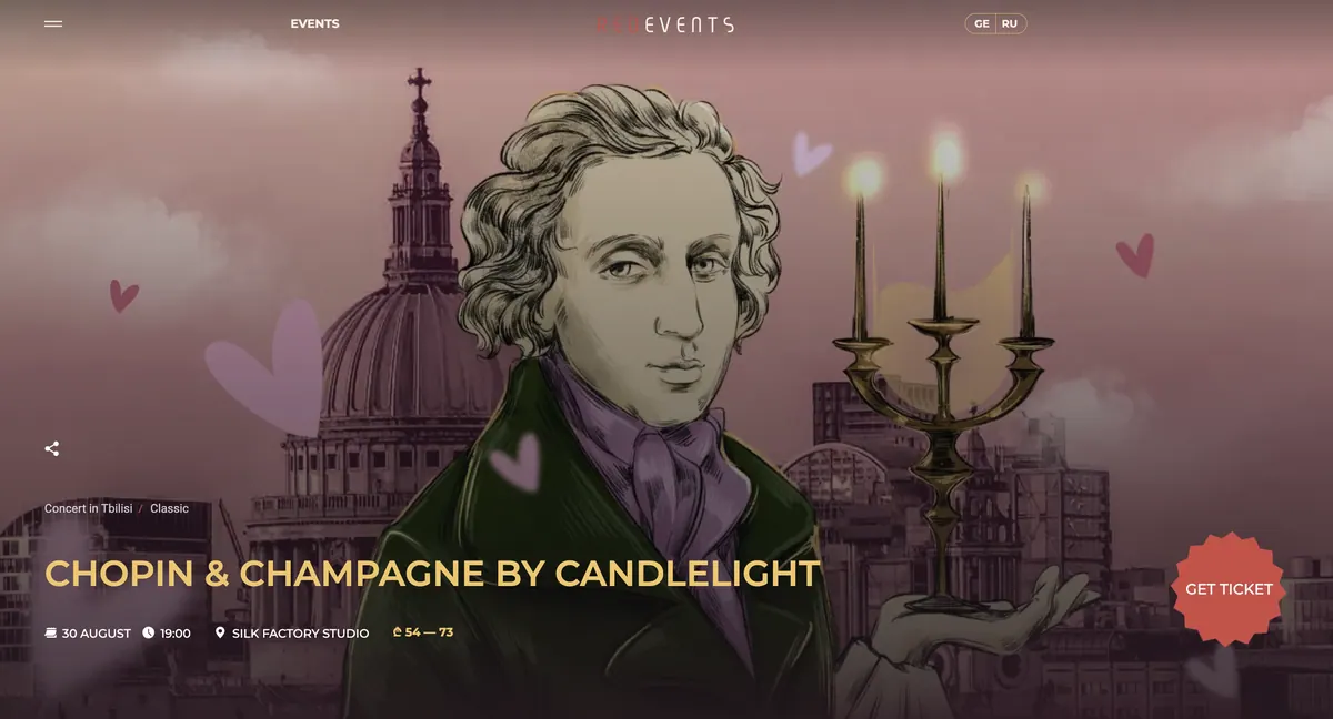
Your event's hero section is the first thing people see, so it needs to make a good impression. Think of it like the cover of a book, it’s got to draw people in. A really good image or video can tell a story about your event without a single word. It sets the mood and gives potential attendees a feel for what they can expect. Making this visual element strong is key to getting people to stick around and learn more.
High-Quality Imagery
Don't skimp on the visuals. Blurry, pixelated images scream 'amateur.' You want something sharp, clear, and professional. This doesn't mean you need a Hollywood budget, but using decent stock photos or, even better, actual photos from past events can make a huge difference. If you're using a photo, make sure it's well-lit and the subject is clear.
Relevant To The Event
The image or video should actually mean something in relation to your event. If you're hosting a tech conference, a picture of a forest probably isn't going to cut it. Show people, places, or things that directly relate to the topic or the experience attendees will have. This helps people quickly understand what your event is about and if it's for them.
Evokes Emotion
Beyond just looking good and being relevant, the visual should make people feel something. Are you aiming for excitement? Inspiration? A sense of community? The right image or video can tap into those feelings. Think about what you want attendees to experience and choose a visual that hints at that. A shot of people networking and smiling at a past event, for instance, can convey a feeling of connection and enjoyment.
Clear Call-To-Action Button
Your event landing page needs a call-to-action button that’s impossible to miss. Think of it as the main event, the thing that gets people to actually sign up or buy tickets. It’s the bridge between interest and action. Without a clear, compelling CTA, all your other efforts might go to waste.
Prominent Placement
Where you put your button matters. It should be in a spot that’s immediately visible when someone lands on the page. We’re talking above the fold, usually right after your headline and hero image. Don’t make people hunt for it. A good rule of thumb is to have it appear at least twice on the page: once up high, and then again further down, perhaps after you’ve laid out more details about the event.
Action-Oriented Text
What you say on the button is just as important as where it is. Forget generic phrases like “Submit” or “Go.” You want text that tells people exactly what they’ll get. Instead of “Register,” try “Get Your Tickets Now” or “Reserve Your Spot.” If it’s a webinar, “Join the Webinar” works well. Make it clear and direct, so there’s no confusion about the next step. This kind of specific wording can really make a difference in your conversion rates.
Contrasting Color
Color is your best friend when it comes to making that button pop. It needs to stand out from the rest of the page design. If your page is mostly blues and whites, a bright orange or green button will grab attention. Think about the overall color scheme of your landing page and choose a color that creates a strong contrast. It shouldn't blend in; it should be the first thing people’s eyes are drawn to after reading your headline. This visual cue guides the user directly to the action you want them to take.
Essential Event Details At A Glance