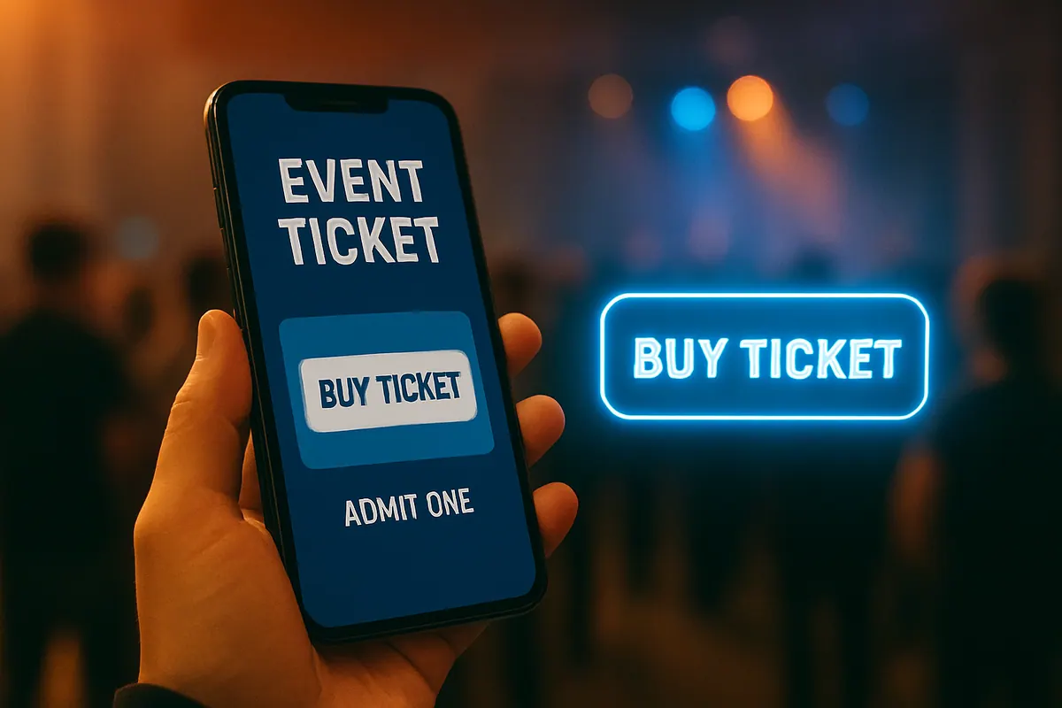
Getting people to buy event tickets can be tricky. It's not just about having a great event; it's also about how you ask them to buy. This means paying attention to the words you use, the colors you choose, and where you put your call to action (CTA). A good event ticket CTA can make a big difference in how many people actually click and buy.
Crafting Compelling Event Ticket CTA Copy
When it comes to selling event tickets, the words you use on your Call to Action (CTA) button or link are super important. It’s not just about telling people what to do; it’s about making them want to do it. Think of it as the final nudge that gets someone from browsing to buying.
Action-oriented language for event ticket CTAs
Using action verbs is key. Instead of a passive phrase like “More Info,” try something that prompts immediate engagement. Verbs like “Get,” “Book,” “Reserve,” or “Buy” tell people exactly what will happen when they click. This directness removes guesswork and encourages a quicker decision. For instance, “Book Your Spot Now” is much more effective than “Click Here.” It’s clear, it’s active, and it implies a limited opportunity.
Concise and focused messaging
People are busy, and their attention spans are short. Your CTA needs to be brief and to the point. Aim for two to five words that clearly communicate the desired action and the benefit. Avoid jargon or overly complex language. A simple, direct message like “Grab Tickets” or “See Schedule” is often more powerful than a lengthy explanation. The goal is clarity, not cleverness.
Highlighting value and benefits
Beyond just the action, hint at what the user gains. If your event offers something special, weave that into the CTA. Phrases like “Get Early Bird Pricing” or “Reserve Your VIP Pass” add an extra layer of appeal. It’s not just about buying a ticket; it’s about securing a specific benefit or experience. Consider what makes your event unique and try to reflect that in your CTA copy. For example, if there's a limited number of seats, a CTA like “Secure Your Seat Before They’re Gone” can create a sense of urgency.
Here’s a quick look at how different CTAs can perform:
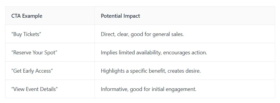
Ultimately, the best CTA copy feels natural and directly addresses the user's intent. Experimenting with different phrases is a good way to find what works best for your specific event and audience. You can find great examples of effective CTA strategies to get you started on this page.
The most effective CTAs often combine a clear action with a hint of the benefit or a touch of urgency. They are short, easy to understand, and make the next step obvious.
The Psychology of Event Ticket CTA Colors
When you're trying to get people to buy tickets, the color of your call-to-action (CTA) button isn't just about looking pretty. It actually plays a big role in how many people click it. Think about it, colors make us feel things, and those feelings can push us to act. It’s not just about picking a color you like; it’s about picking the right color for your event.
Leveraging contrast for visibility
First things first, your CTA button needs to be seen. If it blends into the background, nobody's going to find it, no matter how great the text is. This is where contrast comes in. You want a color that pops against the rest of your page. A button that stands out clearly signals to visitors, "Hey, click me!" This is why some studies suggest colors like orange or red often perform well, they tend to grab attention. But it's not a hard rule; the key is that it contrasts with your specific page design. A bright green button might be amazing on a mostly blue page, but on a page already full of green, it'll just disappear.
Color psychology in event Ticket CTAs
Different colors have different vibes. Orange, for example, can feel energetic and exciting, which is great for a music festival or a fun workshop. Blue often feels trustworthy and calm, maybe good for a more formal conference. Red can signal urgency, like a "limited time offer" for early bird tickets. But be careful, red can also feel aggressive or like a warning. It’s about matching the color’s common associations with the feeling you want your event to give off. You want people to feel excited and confident about buying tickets, not anxious.
Testing color variations for maximum impact
Honestly, there's no single magic color that works for every event. What looks great and converts well for one might fall flat for another. That's why testing is so important. You might think orange is the way to go, but maybe a vibrant blue actually gets more clicks for your specific audience. It’s worth running some tests to see what your visitors respond to best. Even small changes in shade can make a difference. Remember, the goal is to make that ticket button impossible to ignore and easy to click, guiding people smoothly towards purchasing their tickets.
The most effective CTA button color is the one that stands out the most on your page, creating a clear visual path for the user. It's less about the inherent meaning of the color and more about its ability to break through the visual noise and draw the eye.
Strategic Placement of Event Ticket CTAs
So, you've got your ticket CTA wording and color sorted. Great! But where do you actually put it so people actually see it and, you know, click it? It’s not just about having a button; it’s about putting that button in the right place at the right time. Think of it like setting up a lemonade stand, you don't put it in the middle of a busy highway, right? You want it where people are already walking by and might be thirsty.
Above the fold: Immediate visibility
This is prime real estate. When someone lands on your event page, what's the first thing they see? That's the 'above the fold' area. If your ticket CTA isn't visible here, you're missing a huge opportunity. People are often impatient online; they want to know what the event is and how to get tickets without scrolling forever. Having your main CTA button right there, clear as day, means you're capturing attention from the get-go. It’s like putting the most exciting part of the movie trailer right at the beginning. For example, the Ecom World website puts all the key info, including the CTA, right where you can see it without scrolling. They even have the "Buy Tickets" button pop up multiple times above the fold, which really hammers the point home.
End of content: Priming for action
After someone has read all about your amazing event, the speakers, the schedule, the unique selling points, they're probably feeling pretty excited. This is the perfect moment to hit them with the CTA. Placing it at the end of your content, like an article or a detailed event description, acts as a natural conclusion and a prompt to take the next step. They've absorbed all the information and are now primed to act. It’s like finishing a great book and then being told where to buy the sequel. This placement works because it follows a persuasive narrative, making the action feel like the logical next step.
Integrating CTAs Within the User Journey
Don't just stick your CTA in one spot and forget about it. Think about the entire path a potential attendee takes. Maybe they first see a social media post, then visit your website, read a blog post, and then decide to buy. You need CTAs at various points. This could mean a sticky header with a CTA that follows them as they scroll, or perhaps a CTA within an email newsletter they receive. The goal is to make it easy for them to convert no matter where they are in their decision-making process. It’s about removing any friction. For instance, if someone is reading a blog post about a specific speaker, a CTA related to that speaker's session tickets makes a lot of sense right there. It’s about meeting them where they are and offering the next logical step, like getting more ticket examples that fit different stages.
The placement of your ticket CTA isn't just about visibility; it's about timing and context. You want to present the opportunity to buy tickets when the user is most receptive and has all the information they need, or when they are actively looking for a solution your event provides.
Enhancing Event Ticket CTA Engagement
Getting people to click that ticket button is more than just having a good design; it's about making them want to click. We're talking about building excitement and making them feel like they'd miss out if they didn't act. It’s about creating a connection that goes beyond just selling a ticket.
Using urgency and scarcity
Think about it: when something feels limited, we tend to want it more. This is a classic psychological trick that works wonders for ticket sales. Phrases like "Limited Seats Available" or "Offer Ends Tonight!" create a sense of urgency. People don't want to miss out on a great event, especially if they think the opportunity might disappear. It’s not about being pushy; it’s about being honest about availability and deadlines. This can really push someone who's on the fence to make that decision.
Incorporating social proof
Nobody likes to be the first to try something new if they're unsure. That's where social proof comes in. When potential attendees see that others are already buying tickets or that the event is popular, it builds trust. You can show this with things like:
- Join 5,000+ happy attendees!
- Displaying testimonials from past events
- Showing how many tickets have already been sold
Seeing that other people are going and enjoying themselves makes the decision to buy a ticket feel much safer and more appealing. It’s like getting a recommendation from a friend, which is always more convincing than just an advertisement.
Addressing pain points directly
Sometimes, the best way to get someone to click is to show them how your event solves a problem or fulfills a need they have. For example, if people are tired of boring weekends, a CTA could highlight the fun and excitement your event offers. It’s about connecting with what your audience is feeling and showing them that your ticket is the solution they’ve been looking for. We want to make it clear that buying a ticket isn't just a transaction; it's a step towards a better experience. For instance, if you're selling tickets to a relaxation retreat, a CTA like "Escape the daily grind, book your peaceful getaway today" speaks directly to someone feeling stressed. This kind of direct approach can be incredibly effective in getting that click. You can find more creative promotion ideas to boost audience interaction on event promotion strategies.
Making your call to action feel personal and relevant to the user's needs or desires is key. It’s not just about telling them to buy; it’s about showing them why they should buy.
Optimizing Event Ticket CTAs Through Testing